The road to a font choice was long this semester. I had many ideas which when tested either didn’t suit the artistic style, or put across the wrong emotion. Examples below.
My final choices:
Title:
When I began looking for a title font family, I had my mind set on a round font to follow the feeling of sadness, which to me is round and soft.
But when I thought about the reason behind this project, and exploration of grief, it wasn’t just soft. Tt was also harsh, dark and sharp – a stabbing pain like a knife similar to the feeling of a death. To contrast the rounded background hills and clouds, I searched for a textured a font with sharp corners.
First Font:
This font reminded me of a the serif style used on books of family moments and mourning. I have a wide range of these on my shelf, but found that the inspiration didn’t work well with the visual environment I had created.

New font:
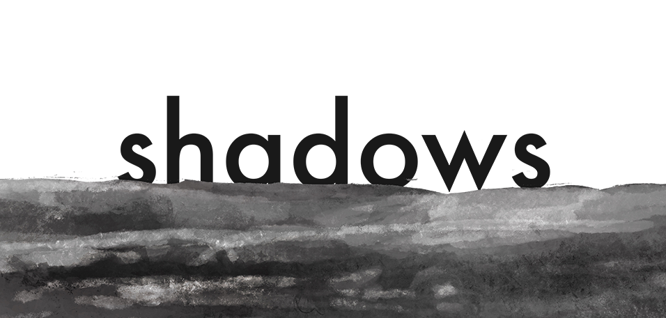
Final rendition in place:


Leave a comment